.png)
Color Customization
In this article we'll be going through the Design features & Color Customizations for the site.
Go to Appearance > Customize on your WordPress Dashboard, then click on Design
Header
Header Layout
You have two options for your layout, one of which features a top bar. Select the one you prefer

Top Bar
Background - Change the background color
Social Icon Color - Change the color of the social icons
Social Icon Background - Change the background of the social icons
Social Icon Color Hover - Change the color of the social icons when you hover over them
Social Icon Background Hover - Change the color of the background on the social icons when you hover over them
To change any of the colors, simply click on them and paste the hexadecimal code, or browse for your preferred color.
Click Publish to save

Default Header
Background - Background color of the header
Bottom Border - Color of the border
CTA Button Link - Color of the text in the button
CTA Button Background - Color of the button
CTA Button Link (Hover) - Color of the button text when you hover over it
CTA Button Background (Hover) - Color of the button when you hover over it
Menu Link - Color of the menu text links
Menu Link (Hover) - Color of the menu text links when you hover over them
To change any of the colors, simply click on them and paste the hexadecimal code, or browse for your preferred color.
Click Publish to save

Menu Link
Here you can change the typography for the link text in the menu. You can change the font as well as the variant (font weight and style)
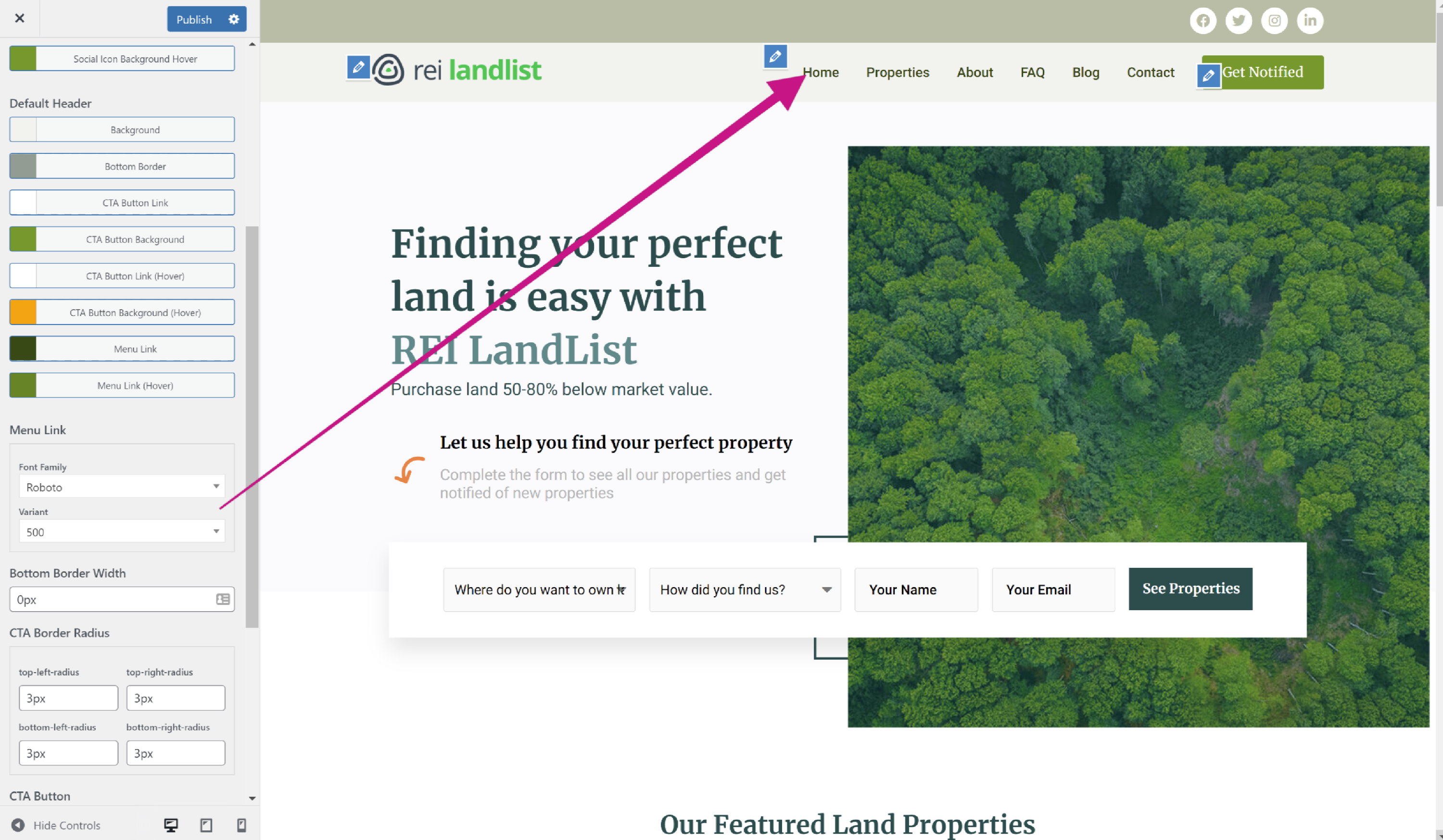
Bottom Border Width
Select how thick you want your bottom border to be

CTA Border Radius
This rounds the edges on the CTA button in your header. Increase the pixel size to make the edges rounder

CTA Button
Font Family - Choose the typography for your button text
Variant - Choose the style for your button text, i.e. weight, italic etc.

Header - Mobile Toggle
This controls the settings for your hamburger menu on mobile
Background - Background color of the hamburger menu
Icon - Color of the hamburger
Background Hover - Color of the background when you hover over it
Icon Hover - Color of the hamburger when you hover over it
To change the color of any of these, simply click on the Select Color box. You will then be prompted to enter the hexadecimal code of the color you require.
Alternatively, you can use the preset colors in the color chart below it
To save, click Publish.
 Content
 Content
Background Color
Color for the background of the website.
Click on it and paste the hexadecimal code, or browse the colors

Body Text
Font Family - Choose the typography for your button text
Variant - Choose the style for your button text, i.e. weight, italic etc.

Forms & Buttons
Form
Input Text - This is the color of your placeholder text on the main form's fields
Input Background - This is the background color of the form's fields
Input Border - This is the color of the border surrounding the input fields

Form Input Border Width
This is the width of the border box, to change it, just edit the pixel size.

Form Input Border Radius
This allows you to create more rounded edges on the form fields. To adjust simply change the pixel size.

Input Fields
Here you can change the font style and weight of the text in the form
Font Family - Click this to browse different fonts and select the one that suits your branding best
Variant - This is where you can select the font style and weight (bold). Click to browse and select the one that suits your branding best

Search Form
Here you can change the color of the text for the property search form
Input Text - This is the color of your placeholder text on the main form's fields
Input Background - This is the background color of the form's fields
Input Border - This is the color of the border surrounding the input fields

Search Form Input Border Width
This is the width of the border box, to change it, just edit the pixel size.

Search Form Input Border Radius
This allows you to create more rounded edges on the form fields. To adjust simply change the pixel size.

Primary Buttons
Primary buttons pertain to the button in the main form
Background - This is the background text of the button. To change it, click on the button and either paste in your hexadecimal code or browse the shades until you find something you like.
Text - This is the text color on the button. To change it, click on the button and either paste in your hexadecimal code or browse the shades until you find something you like.
Background Hover - This is the background color when you hover over it. To change it, click on the button and either paste in your hexadecimal code or browse the shades until you find something you like.
Text Hover - This is the text color when you hover over it.

Primary Button Border Radius
This allows you to create more rounded edges on the button. To adjust simply change the pixel sizes.

Primary Button Typography
Here you can change the font style and weight of the text in the button.
Font Family - Click this to browse different fonts and select the one that suits your branding best
Variant - This is where you can select the font style and weight (bold). Click to browse and select the one that suits your branding best

Secondary Buttons
Secondary buttons pertain to the button where you search for properties
Background - This is the background text of the button. To change it, click on the button and either paste in your hexadecimal code or browse the shades until you find something you like.
Text - This is the text color on the button. To change it, click on the button and either paste in your hexadecimal code or browse the shades until you find something you like.
Background Hover - This is the background color when you hover over it. To change it, click on the button and either paste in your hexadecimal code or browse the shades until you find something you like.
Text Hover - This is the text color when you hover over it.

Secondary Button Border Radius
This allows you to create more rounded edges on the button. To adjust simply change the pixel sizes.

Secondary Button Typography
Here you can change the font style and weight of the text in the secondary button.
Font Family - Click this to browse different fonts and select the one that suits your branding best
Variant - This is where you can select the font style and weight (bold). Click to browse and select the one that suits your branding best

Property
Property Layout
This shows how your properties will be laid out. Select the one that you prefer.

Property List
To change any of the below colors, simply click on the colors and paste the hexadecimal code or browse until you see the color you like.
Title - Title of the property
Link Hover - Color of the Title when you hover over it
Primary Price - The price of the property
Secondary Price - The price under the finance terms
Property Label Featured Property - Color of the featured label
Status Label For Sale - Color of the box that shows For Sale
Status Label Sold - Color of the box that shows Sold
Status Label Under Contract - Color of the box that shows for Under Contract
Status Label Coming Soon - Color of the box that shows Coming Soon

Property Title
Here you can change the font style and weight of the text in the title
Font Family - Click this to browse different fonts and select the one that suits your branding best
Variant - This is where you can select the font style and weight (bold). Click to browse and select the one that suits your branding best

Property Price
Here you can change the font style and weight of the price
Font Family - Click this to browse different fonts and select the one that suits your branding best
Variant - This is where you can select the font style and weight (bold). Click to browse and select the one that suits your branding best

Property Status Label
Here you can change the font style and weight of the text in the property status label.
Font Family - Click this to browse different fonts and select the one that suits your branding best
Variant - This is where you can select the font style and weight (bold). Click to browse and select the one that suits your branding best

Single Property
The following settings are for when you're in a specific property
Gallery Slider Layout
Select how you want your properties to appear by clicking on the appropriate tile.

Carousel Image Size
Select either, Default, No Crop or Contained Height.

Carousel Image Height
Select your carousel height in pixels. This option only appears when the Contained Height option is selected under Carousel Image Size.

Property Feature Icons
Select your preferred icons by choosing your preferred tile.

Once you're done, click publish to save changes
Footer
Footer Layout
Select your preferred footer layout

Enable Footer Pattern
Shows a mountain image just above your footer. Toggle to enable
Footer Pattern
To change the following colors, simply click on them and paste in your hexadecimal code or browse until you find your preferred color.
Color Fill - The main color of the image
Background - The color of the background

Top Footer
The Top footer is the larger footer. To change the following colors, simply click on them and paste in your hexadecimal code or browse until you find your preferred color.
Background - the background color of the footer
Border - the color of the border
Text - the color of the text
Link - the color of the link text
Link Hover - the color of the link text when you hover over it

Top Footer Border Width
Adjust the pixel size to create your own custom border

Edit Top Footer Widgets
Click on this and you'll be able to select which content goes into your footer.

Bottom Footer
The Bottom Footer is the smaller, thinner footer at the bottom of the page. To change the following colors, simply click on them and paste in your hexadecimal code or browse until you find your preferred color.
Background - the background color of the footer
Border - the color of the border
Text - the color of the text
Link - the color of the link text
Link Hover - the color of the link text when you hover over it

Bottom Footer Border Width
Adjust the pixel size to create your own custom border

Edit Bottom Footer Details
Click on this to edit the text in the bottom footer

Once you're done, click Publish to save changes
Reset Style
Press Reveal Buttons
Select the theme your using and choose whether to reset just the typography or all the style settings.
